Andy Townsend
I am an eighteen-year-old artist who hopes to take art further in my life.
I have both heard and read that the course is exemplar and wish to improve and develop my skills in a way fitting of a professional illustrator with the goal of becoming a children's illustrator.
Please scroll down for more of my work!
I hope to hear from you soon!
© All rights reserved.
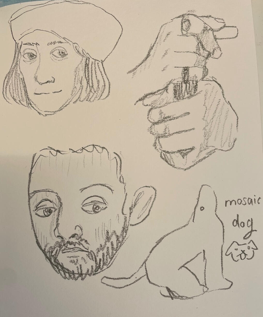
Here are some sketches based on works I found at my local museum- I looked at the different styles through the ages (mostly of royals) and how shadowing can be translated into pencil from an oil painting.
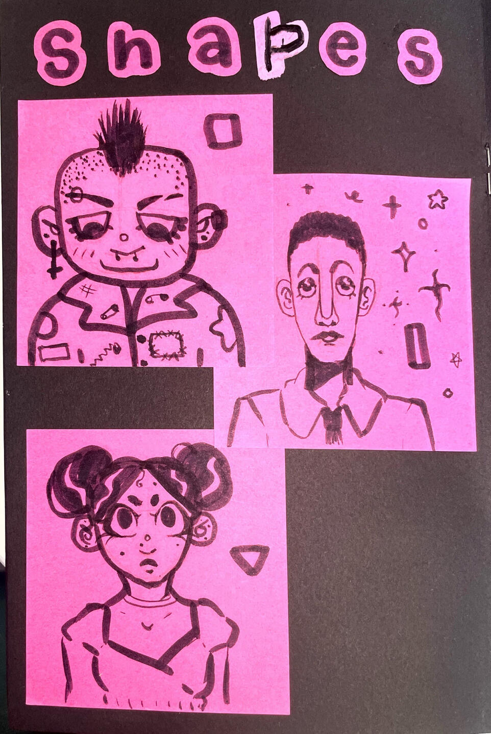
I practiced drawing faces around different shapes- this helped me be more diverse and also focus on line weight!
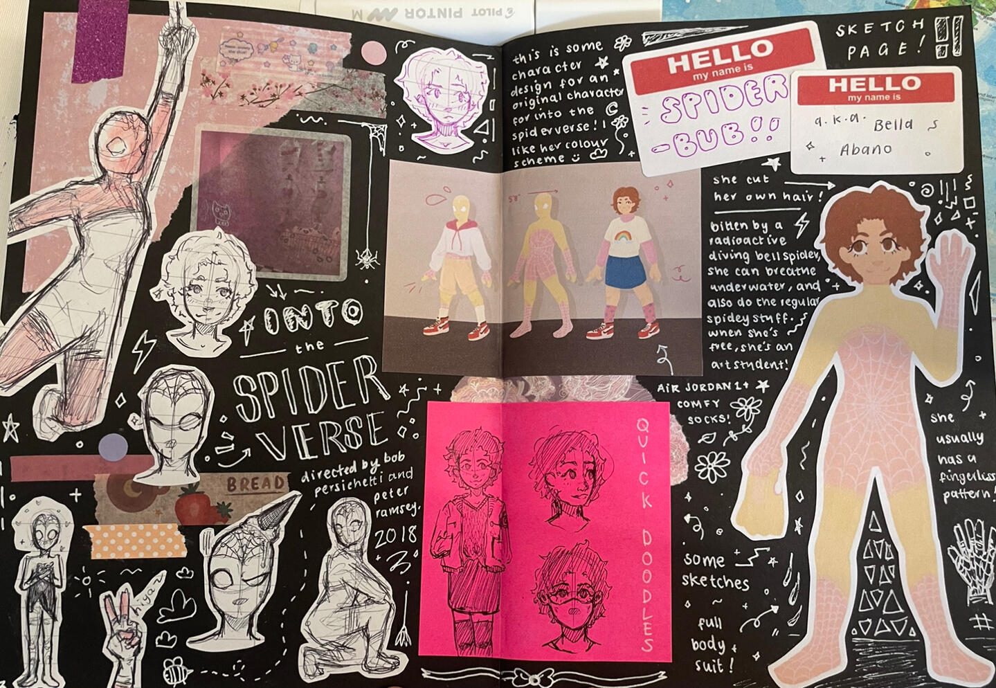
This is a spread on an original character I designed- I based her on bubblegum after watching Spiderman: Into The Spiderverse!
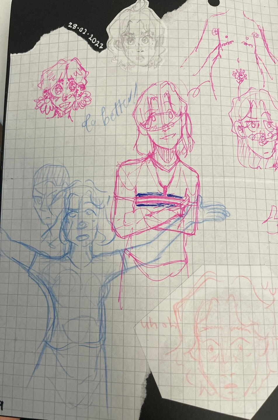
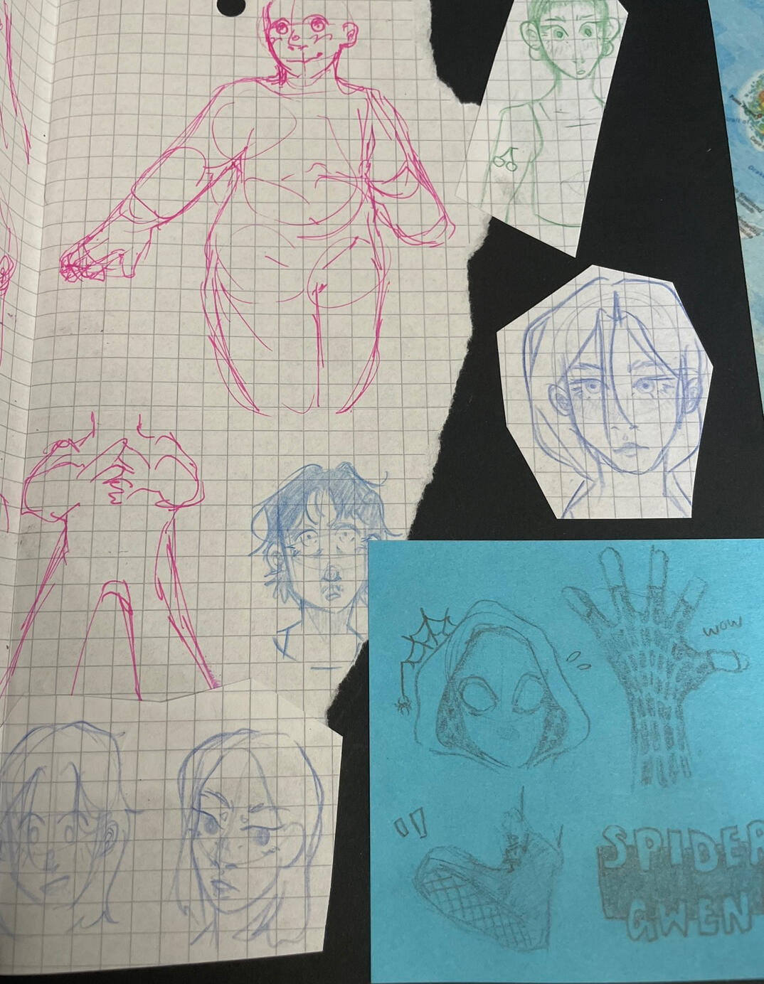
Here is a double-page spread on some sketches to show how I draw the basic designs that I use for digital art- I didn't use any of these as I couldn't decide how to take them further.
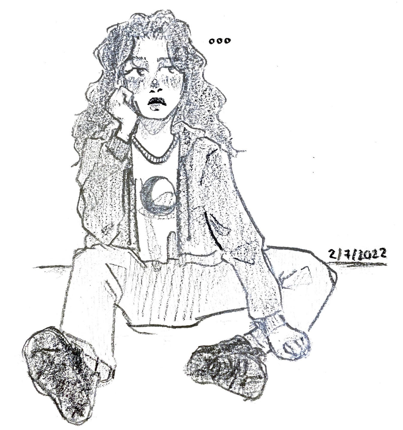
This drawing of a girl was with a photo reference, which helped with my proportions and clothing folds. It also helped me practice hatching with straight lines.
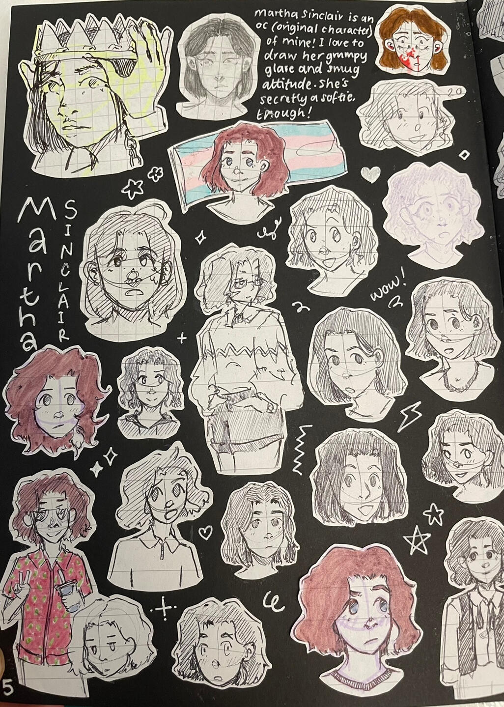
This is my page on another original character, in which I would cut out all my drawings and keep them in the same place so I could have a reference page and idea of her character. It helped me flesh out her expressions as well as her clothing styles.
Frog and Leaves Lino Print
In this lino print I used transparent lino and traced my frog drawing for the design, and coloured the leaves with pencils. I am happy with the texture that the carved out lino left behind. but I didn't vary the line weight which I think would have helped him look more dynamic.
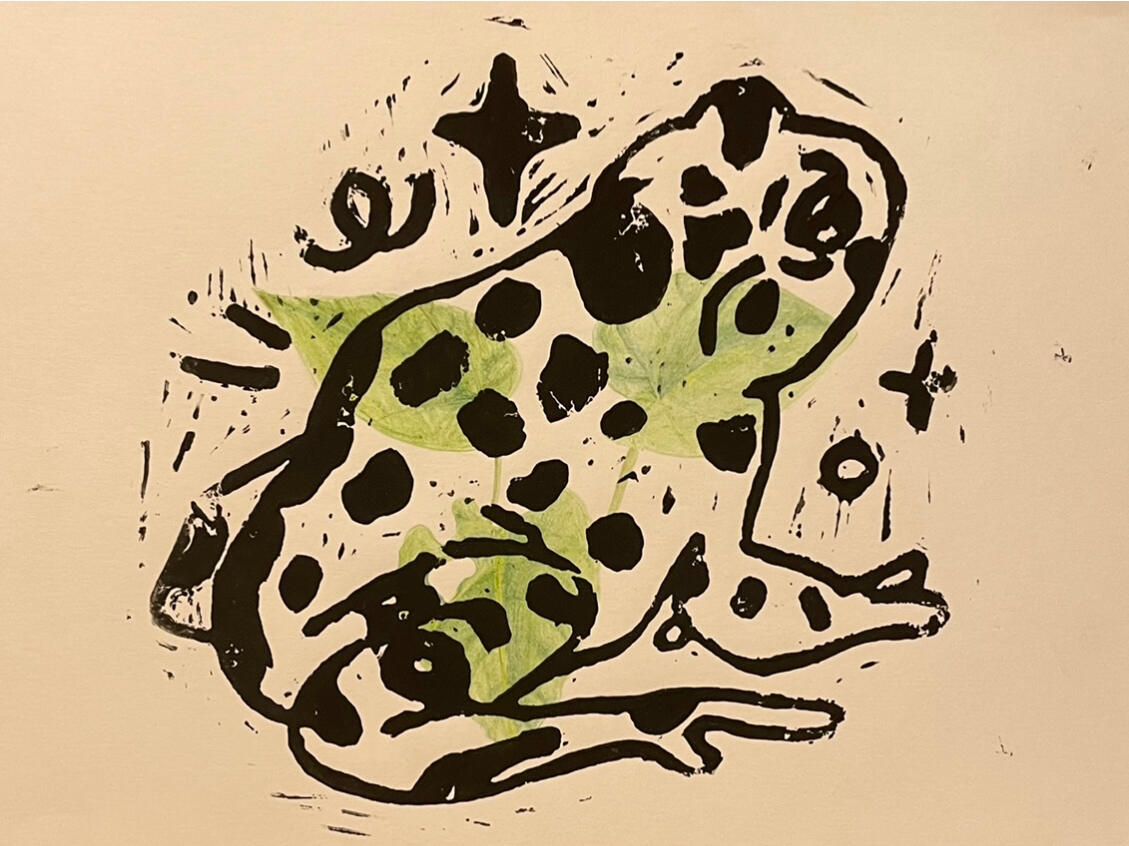
25/7/2022
Frog, Mushroom &
Cloud Lino Print
I am pleased with the style of the cloud and how the shading for the mushroom differs to the frog. The grass is not as detailed as I would have liked, but inking in more detail to the design went well, as well as adding texture appropriately to the toad.
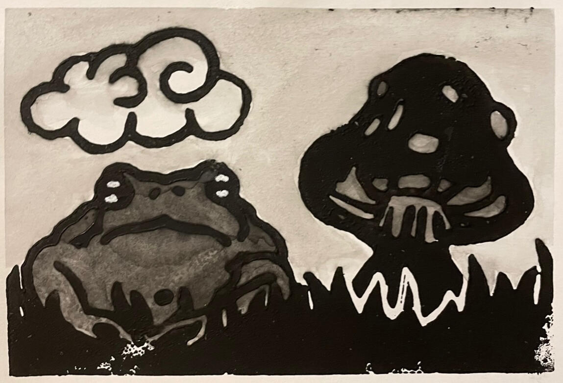
4/8/2022
Ink & Watercolour of a fairy in her Fairy Ring
This is a very simple piece which I was unsure about outlining, but I am glad I did as it helped define the colours more clearly. The mushrooms all had different designs which I enjoyed, and due to using a photo reference for the fairy I was able to keep her proportionate: although I freestyled her ears. My lining was not perfect; I made some mistakes with her arms and with smudges I am glad I didn't attempt to line the grass as I feel I would have made it appear too dark. I also added some highlights with white pen, which helped add volume as well as slight surrealism as it was whiter than I intended.
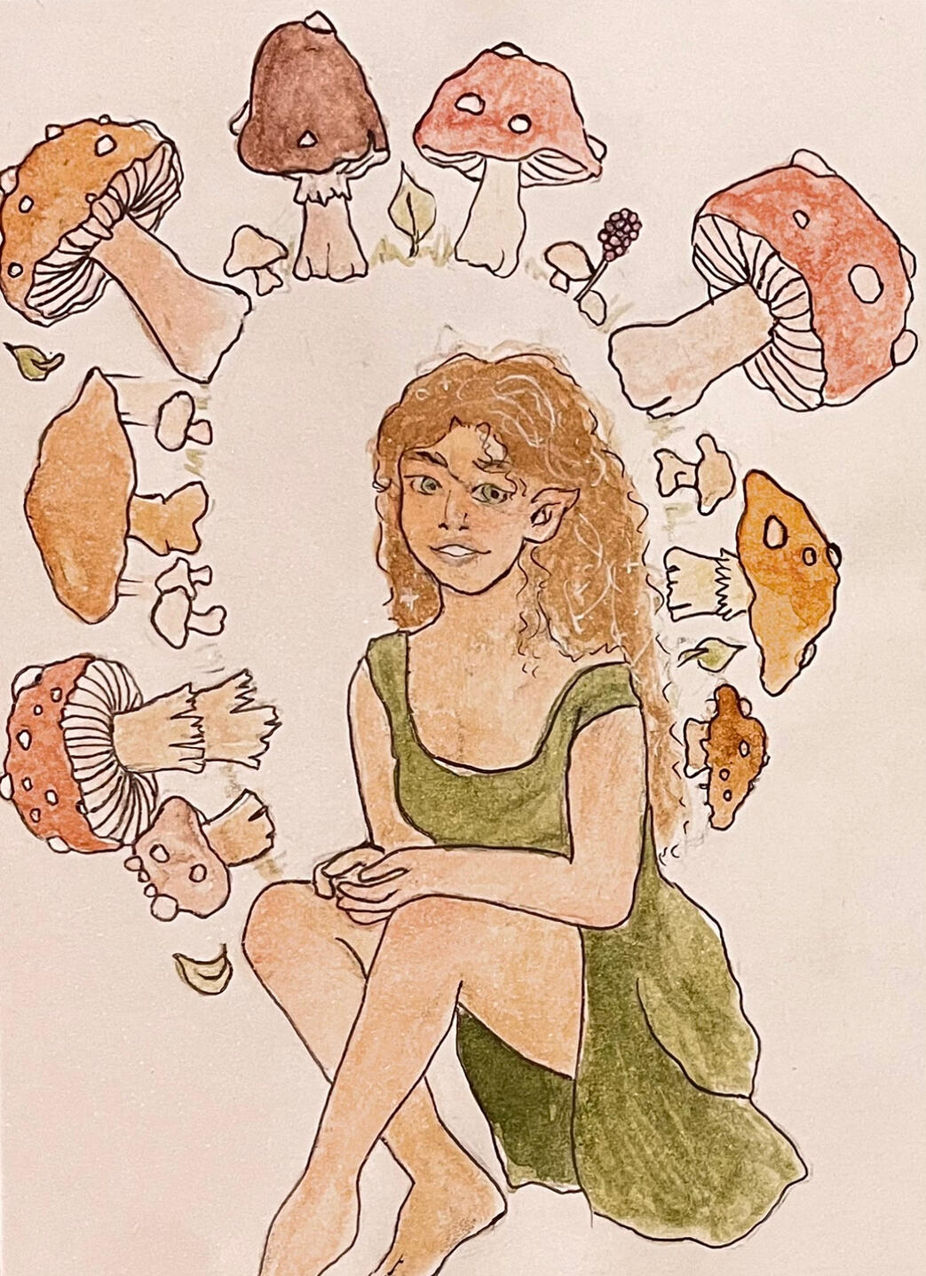
4/8/2022
Watercolour Sketch of a Model
[as copied from description]
In this piece, I used pencil to have an idea of what to paint, then used hatching to create a more prominent shading effect. I also used pencil for her hair and main facial features' outline. I experimented with colour more on the top face, introducing warmer and darker tones - red and orange for blush, and blue and purple in the shadows. It helped this appear more lifelike and eye-catching and I'm glad that I chose to incorporate them. It has also influenced the mood- the bottom drawing looks more sombre in comparison, but this may be due to the more down-turned eyes, eyebrows and head tilt. The black outline also helps the colour stand out, as well as seperating the two angles from each other- as if from different perspectives. It could show one as her inner emotions, and one as her external expression, but be up to the viewer as to which is which. Her lack of clothing shown also helps her appear move open and bare.
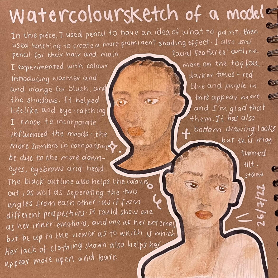
26/7/2022
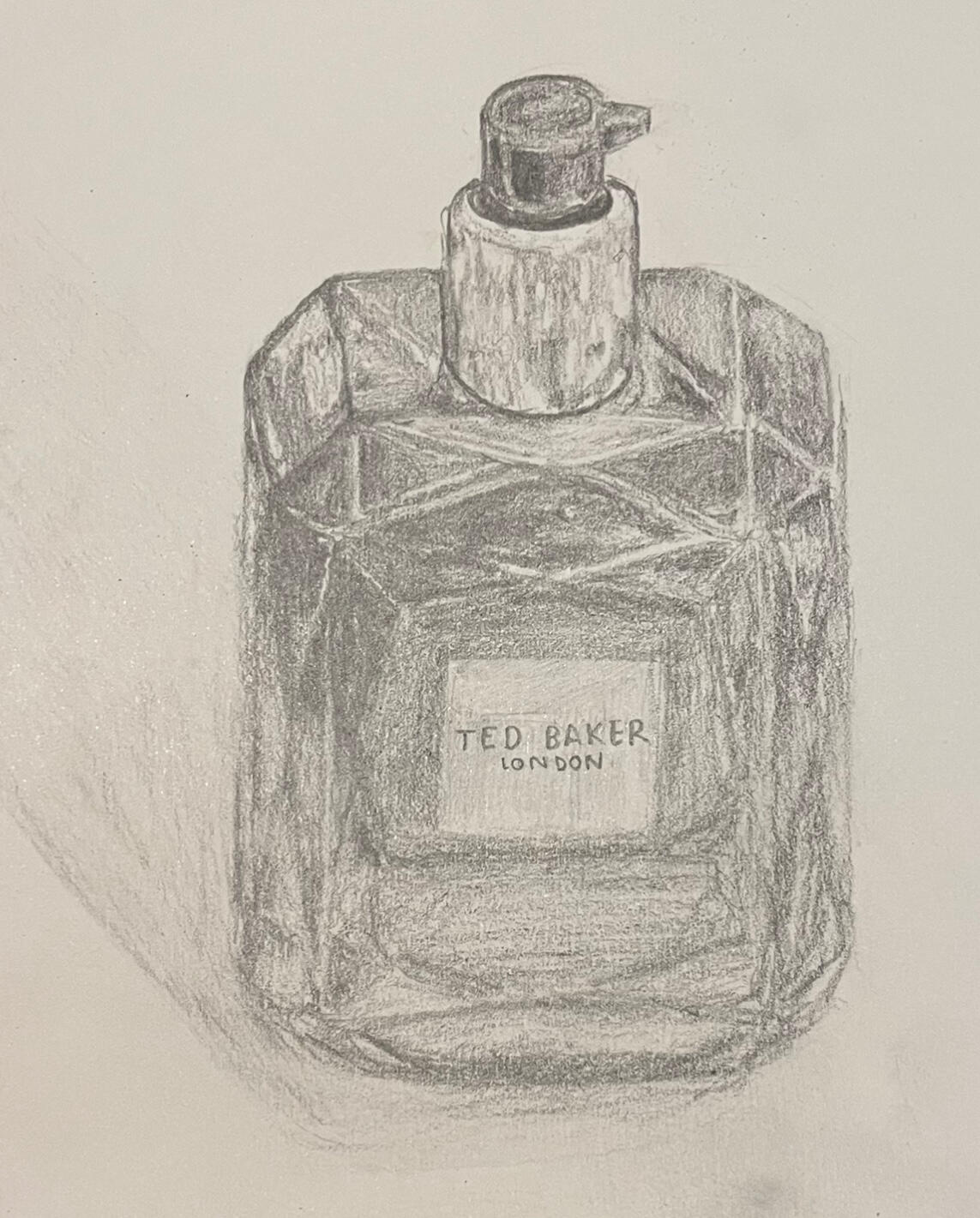
Ted Baker Perfume Still Life Drawing
This was a good subject as I could show all the reflections well, making it more realistic. Working in monotone also helped me focus more on lighting and proportions instead of colour, and as there were so many dips in the design it came out well.
4/8/2022
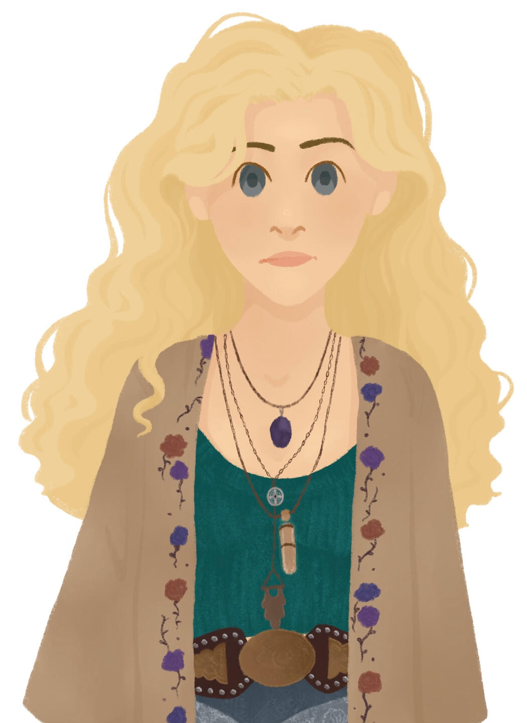
Misty Day Digital Drawing
This commissioned work turned out well- especially her hair, and the detail for her jewellery and clothing. I would include the whites of her eyes if I chose to draw her again, as well as more tones to her face, but I think the cartoon style I was going for was achieved.
7/4/2021
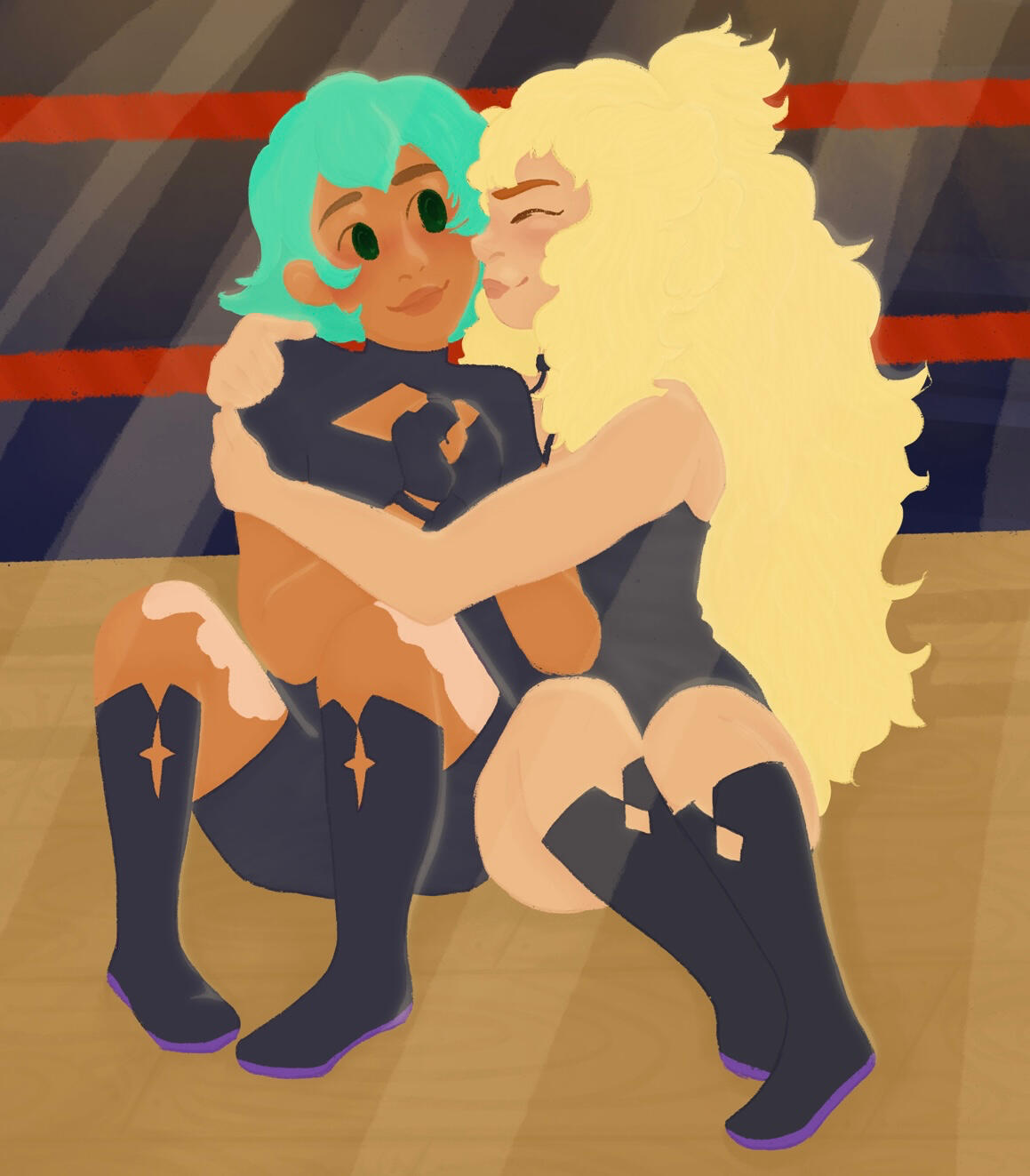
Cass (left) and Toast (right) Digital Drawing
This is one of my first full body drawings, of two characters from the show "Bee and Puppycat". It is mentioned that they wrestled together, so I drew them in a ring. I also designed their costumes- Toast's boots and costume was already shown but Cass' had not been, so I based it off a variation of Toast's. I struggled with lighting and shadows but I am pleased with their proportions and positions.
22/2/2021
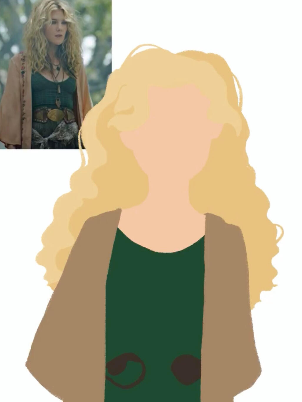
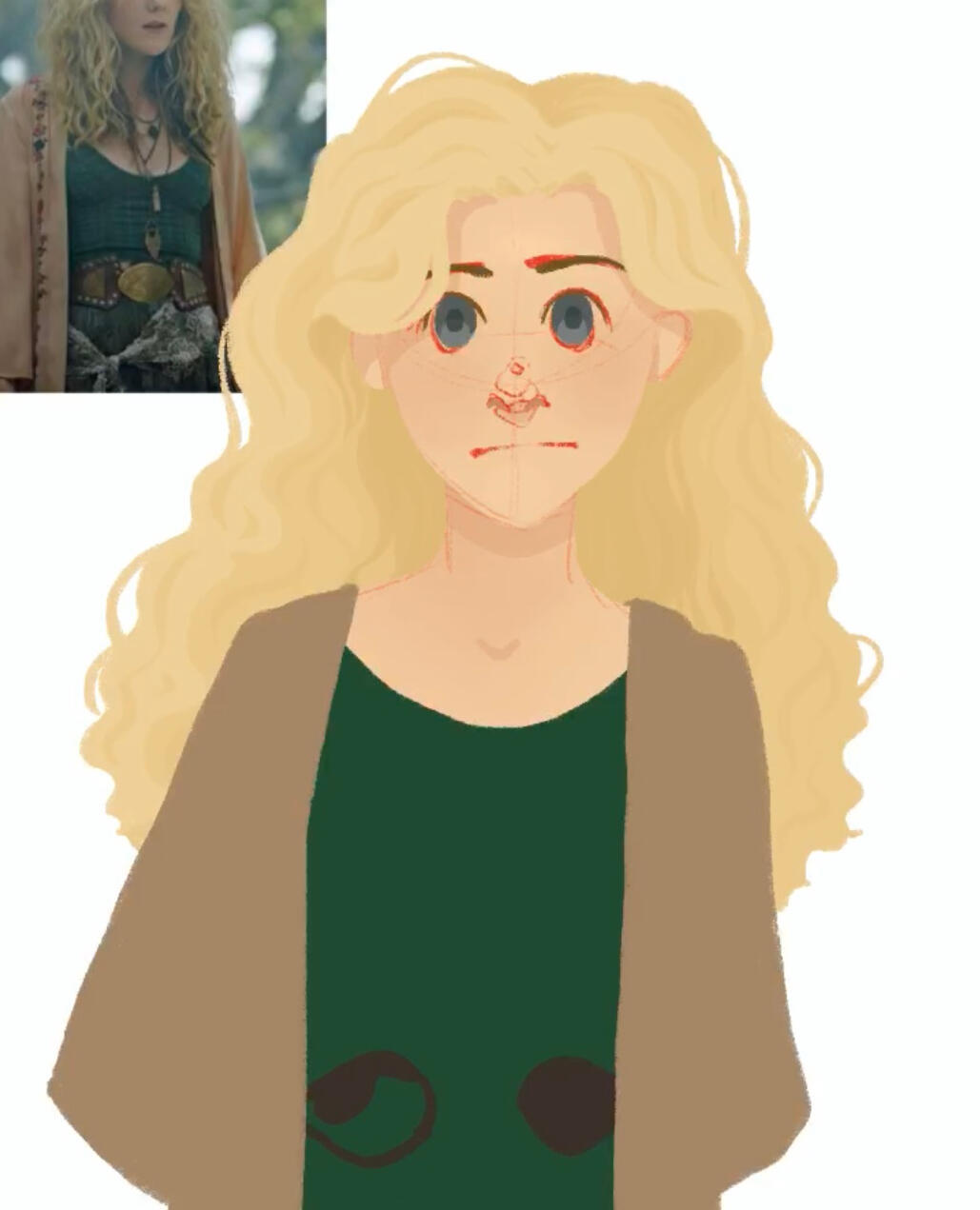
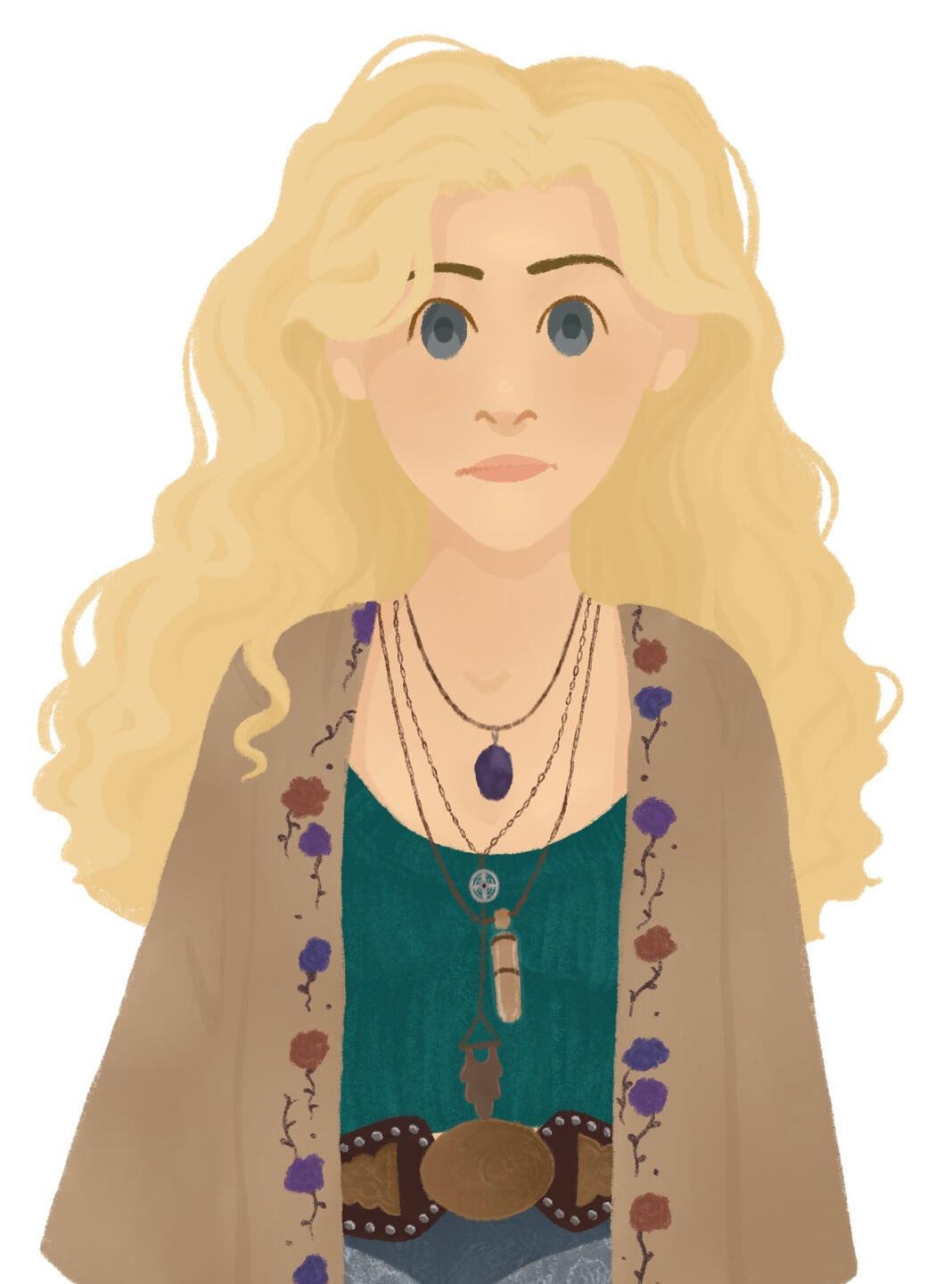
Sutton Regan Digital Drawing
This is one of my most recent and favourite drawings. Using a photo reference helped my drawing be more proportionate, as well as keeping it dynamic. I enjoyed adding purple lighting to her face, as it highlighted shadows and also added another interesting aspect to the drawing. Drawing her clothes without a reference went well, but there is not much contrast for the shadows.
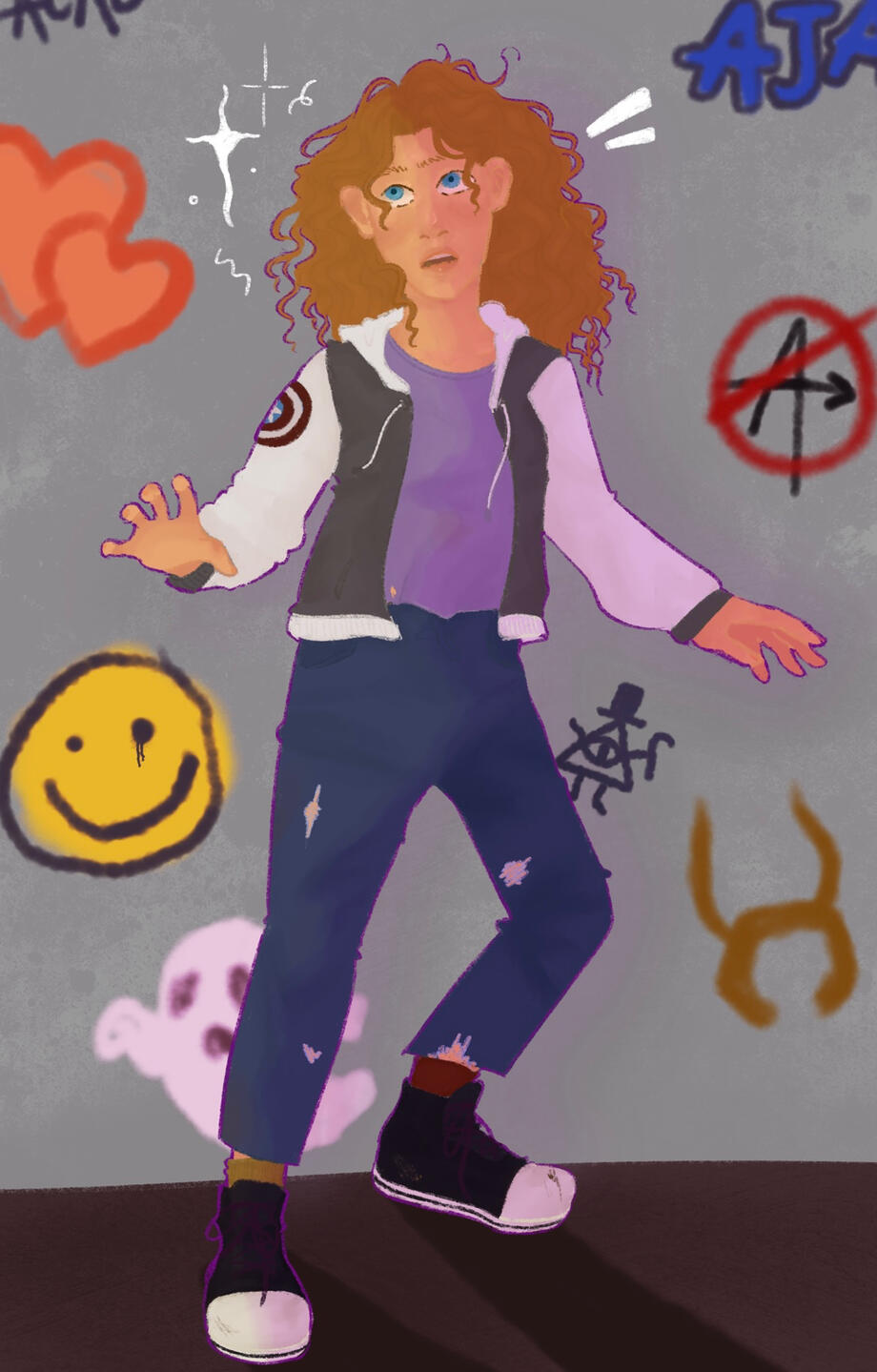
10/7/2022
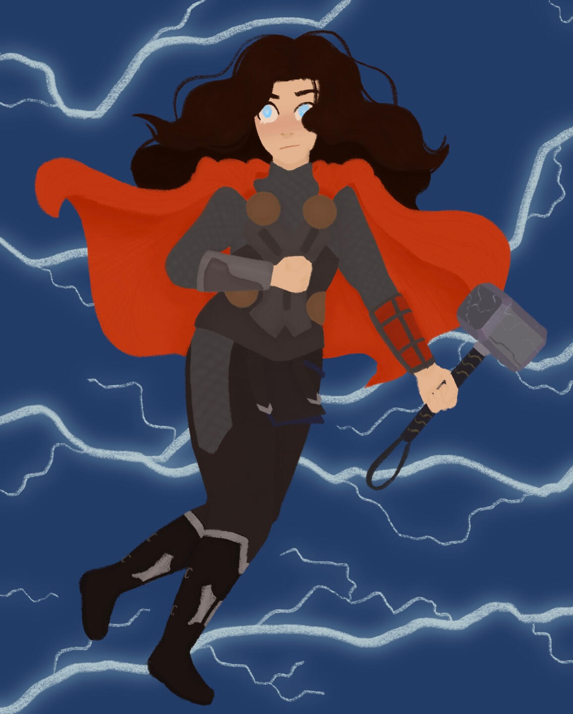
Darcy Lewis as Thor digital drawing
I tried to copy Thor's costume as closely as possible in this, and ended up switching mjolnir to another hand so her costume would be more visible. Although her hair is dynamic, it could look more realistic (especially at the ends), and the same could be said for the cape. There could also be more contrast - I added the hammer later on, so it is more visible with shading in camparism to her hands/face.
12/2/2021
Tony Stark Digital Drawing
I wanted to branch out to drawing more men, and decided to base this drawing off of Schiti's Tony Stark. Sticking to a semi-realistic style and keeping his masculine features was a slight struggle, but adding the colours of his suit in the background was a feature I enjoyed adding in.
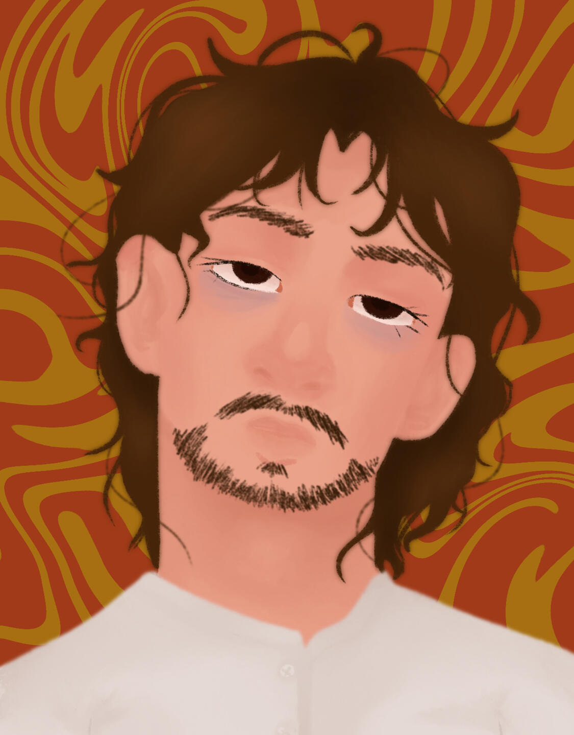
28/7/2022
Space Princess Digital Drawing
I enjoyed drawing the details in her sleeves, as well as being able to design her dress and play with colours. In this piece I would make her hair more realistic- perhaps by adding more stray/ thinner strands of hair- but I did touch up her face to add more depth and shadows as it was previously very flat.
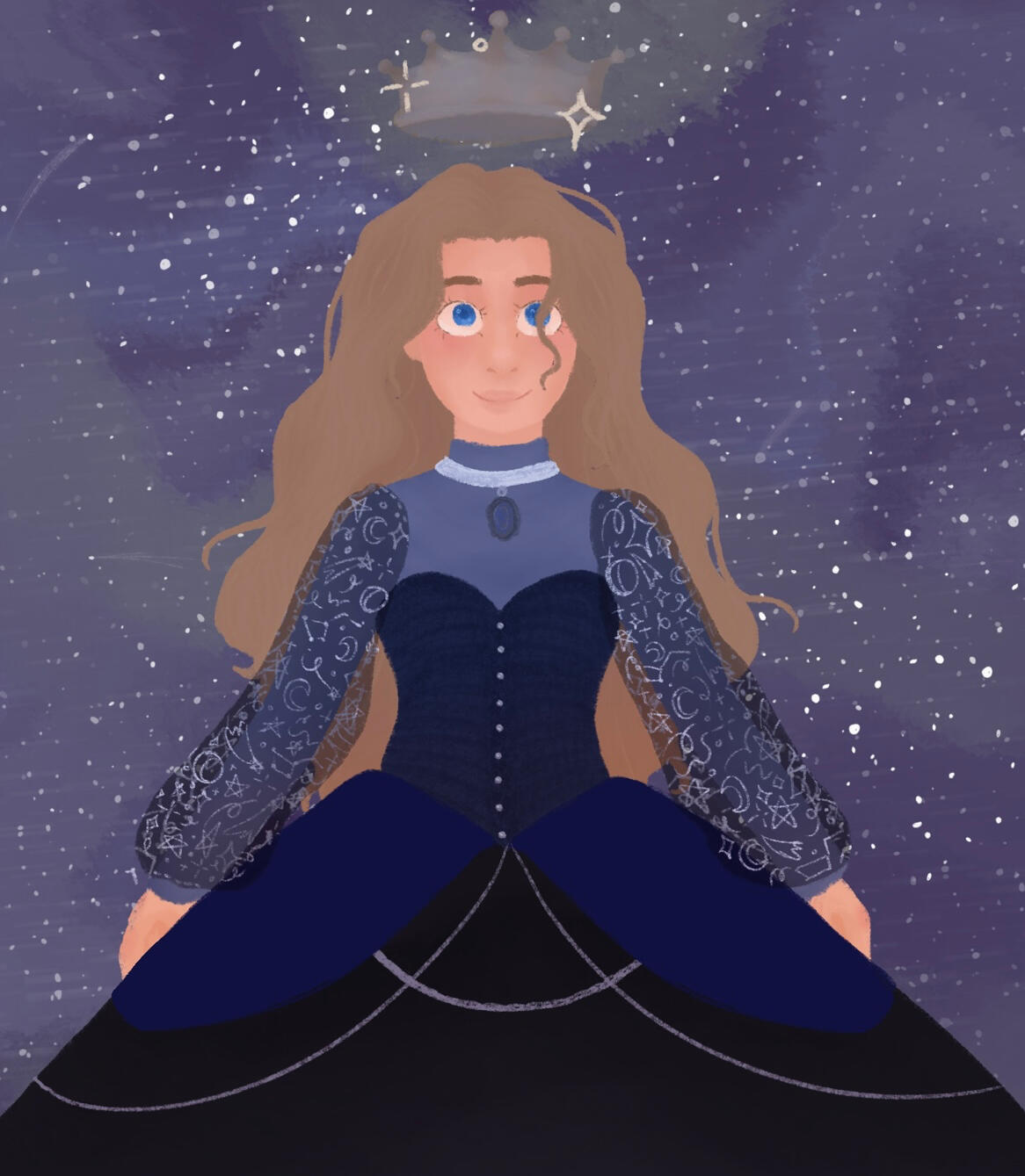
5/7/2022
First, I sketch out what I want to draw, often on lined paper so I can keep things proportionate. I already had pictures of Misty as this was commissioned so I wanted to be as accurate as possible.
Then, I block out the colours so I have a base on which to add detail. This also helps me make sure it is proportionate- for example, this helped me realise her chin was uneven by having plain shapes to critique.
No I add more detail to the drawing- usually the face. I keep the sketch and draw over it to make sure that it's symmetrical and appealing. This is also where I start to play with colours; shading and highlights play in soon.
Here is the final product; as I wasn't paid to add a background I decided not to. I changed the tone of her top to be more like the reference, and added detail to her clothing. Making her jewellery accurate was harder than I expected but it all turned out well in the end!
I consider art to be a cornerstone of my life. From doodling in class to understanding the world around me through an artistic lens, when offered pen and paper I prefer drawing instead of writing. I feel the strongest affinity and enthusiasm towards the subject as it is individualistic and encourages personal creativity, which is why I chose to study it further. In the future, I hope to become a children’s illustrator- I loved looking through their art when I worked in a children’s toy shop and my enjoyment of whimsical artwork has not diminished since.
When studying my GCSE’s, I enjoyed having a subject where I could explore different mediums and subjects in art itself. However, despite my high grade I was discouraged from taking it further and so did not study art as an A-Level. This led me to teaching myself through college- owning an iPad helped me develop my digital art and working in a clothes shop helped me learn the dynamics of clothing and further my anatomy skills through customer interaction.
I was encouraged to take art further by a friend and colleague, and with his advice decided Illustration would be most suitable course. Being able to study different media- including printmaking, with the blocked colours always appealing to me, the different areas that illustration is used, and the focus on developing our work through projects is an exciting opportunity. Furthermore, the ability to get feedback from across the globe on my future portfolio would be exceptional.
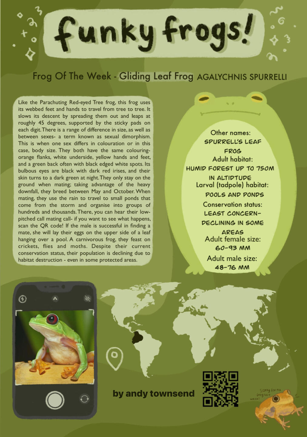
The decisive step for me was when a customer noticed my drawings that I frequently made on the back of paper bags and asked to keep it since she loved it so much. This encouragement from a stranger has been one of the brightest lights that have shone through my journey to become an illustrator. Alongside studying Sociology, Psychology and English Language at college, I joined the student newsletter and write and illustrate about frogs, which helped me learn basic formatting and functions of Procreate.
My artistic inspirations include Banksy and Van Gogh, have encouraged me to keep creating even when I feel negative about my work, and Cassils- a transgender artist who creates work that is simultaneously beautiful and thought provoking. Their description of being trans as, “not as a crossing from one sex to another but rather as a continual process of becoming,” was something I resonated with myself as a transgender person.
I also want to take this course to improve on my work. Despite my development in grasping anatomy and range of textures, I still struggle with drawing men and my work often are simply based on an idea instead of having development and layers. However, I have been reading critiques of work and pushing myself to practice drawing what I struggle with in order to improve. I also hope to develop composition alongside my range in subjects.
When it comes to my identity, art has always helped me express myself which is why I hope to be able to develop my ability to create and critique it further in this course. I hope to share my creative expression with other people so I can present a message- which I have done through letters for personal correspondences across the globe, and art made for my own entertainment. By taking this course, I hope to create art that helps people learn about themselves and the world around them.